Front-end
December 16, 2021
Features Introduced with Bootstrap V5 Alpha
Author:
Seçil Durgun
Bootstrap is one of the most popular interface development libraries developed by the Twitter (X) team. Bootstrap V5, which allows for creating responsive and dynamic websites, was released in its alpha version on June 16, 2020.
Let’s take a look at the new features introduced with Bootstrap V5.
What has changed with the V5 release?
One of the most notable changes in Bootstrap V5 is the removal of jQuery and Internet Explorer support.
So, what will Bootstrap use instead of jQuery?
Bootstrap has announced that it will continue with Vanilla JavaScript for the V5 release. This means that projects built with Bootstrap V5 will be significantly more performant regarding file size and page load speeds in the future.
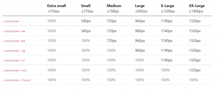
In versions before V5, classes such as sm, md, lg, and xl were used. With the introduction of the xxl class, there is no longer a need to specify an additional media query for sizes “≥1400px”, i.e., 1400px and above.
You can view the container-width structures in the table below.
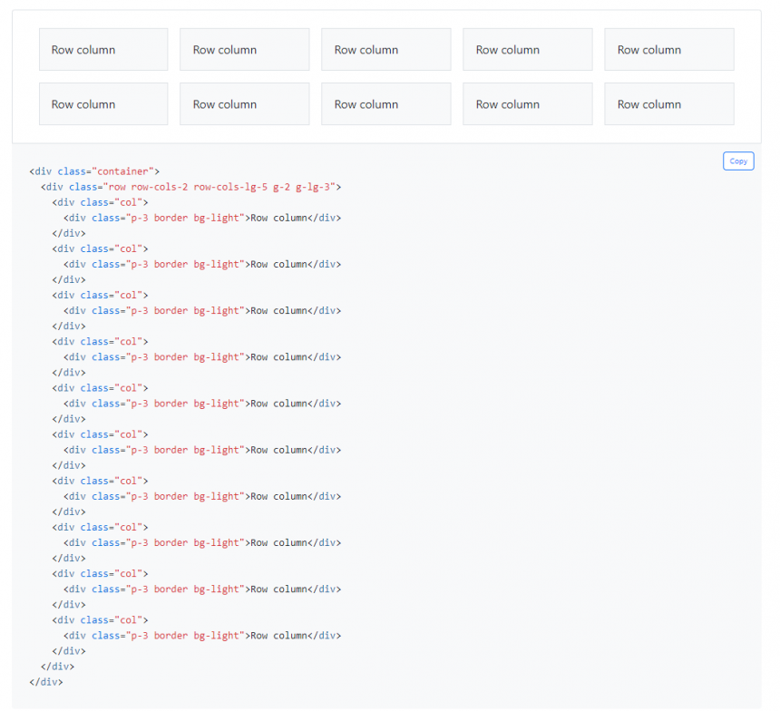
Additionally, you can explore the grid structures here.
Another feature introduced with Bootstrap V5 is the Customize area.
This area is beneficial if you are using Node.js. It allows you to customize Bootstrap to fit your website’s needs and revise it according to your preferences.
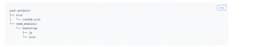
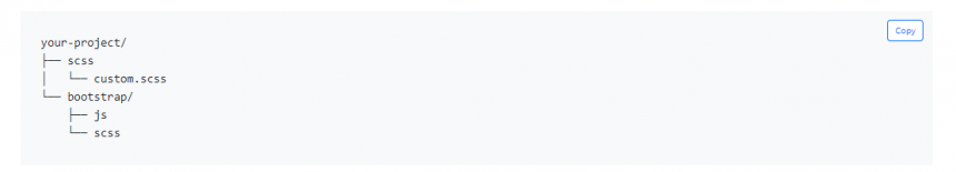
For more detailed information, you can refer to this link.
With the release of Bootstrap V5, the color palette has also changed. Additionally, you can use classes without writing extra code in SASS variables and the Bootstrap scss/_variables.scss file.
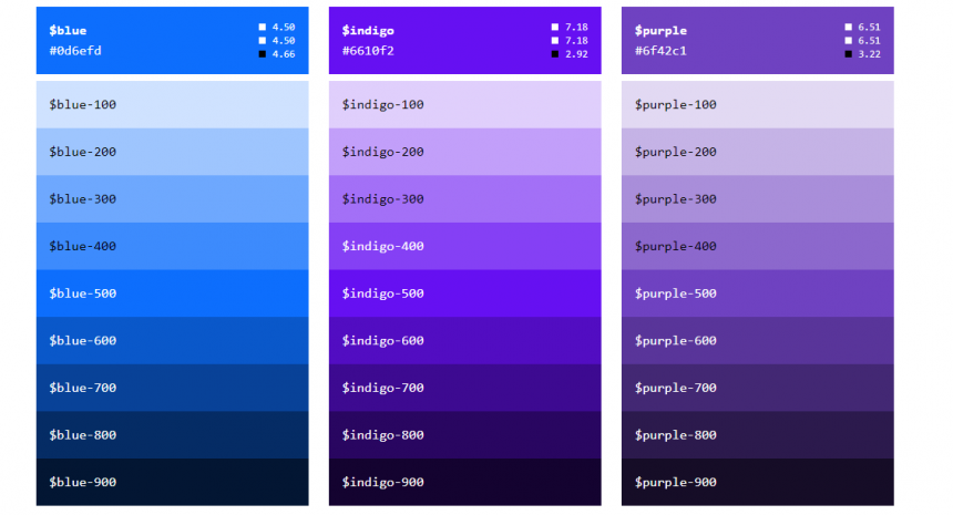
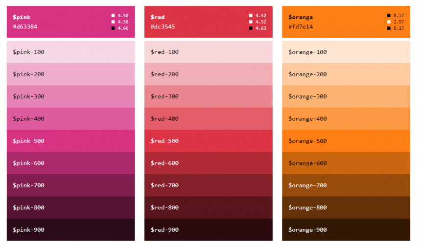
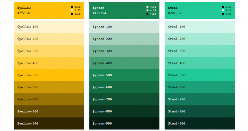
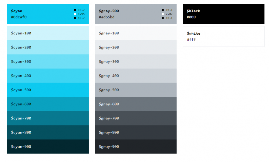
You can find it here for more detailed information about the color palette.
With Bootstrap V5, form controls have also been updated.
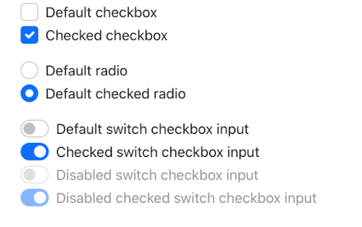
You can find more detailed information here.
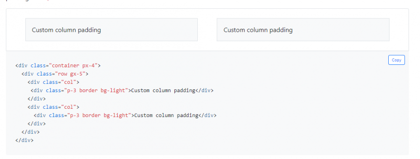
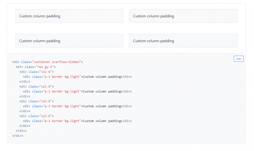
g – gx – gy Classes
You can find more detailed information on the g, gx, and gy classes here.
Before Bootstrap V5, float-left and float-right were used. However, with V5, these CSS classes have been updated.
Here are the updated float classes:
.float-start
.float-end
.float-none
.float-sm-start
.float-sm-end
.float-sm-none
.float-md-start
.float-md-end
.float-md-none
.float-lg-start
.float-lg-end
.float-lg-none
.float-xl-start
.float-xl-end
.float-xl-none
.float-xxl-start
.float-xxl-end
.float-xxl-none
One of the significant advancements in Bootstrap V5 is including an icon package. Previously, icon libraries like FontAwesome or Material Icons were used. Now, a free, high-quality, open-source icon library with approximately 1,200 icons exists.
You can add and customize these icons in various ways, including SVGs, animated SVGs, or web fonts.
Additionally, V5 provides the flexibility to use these icons with or without Bootstrap in any project.
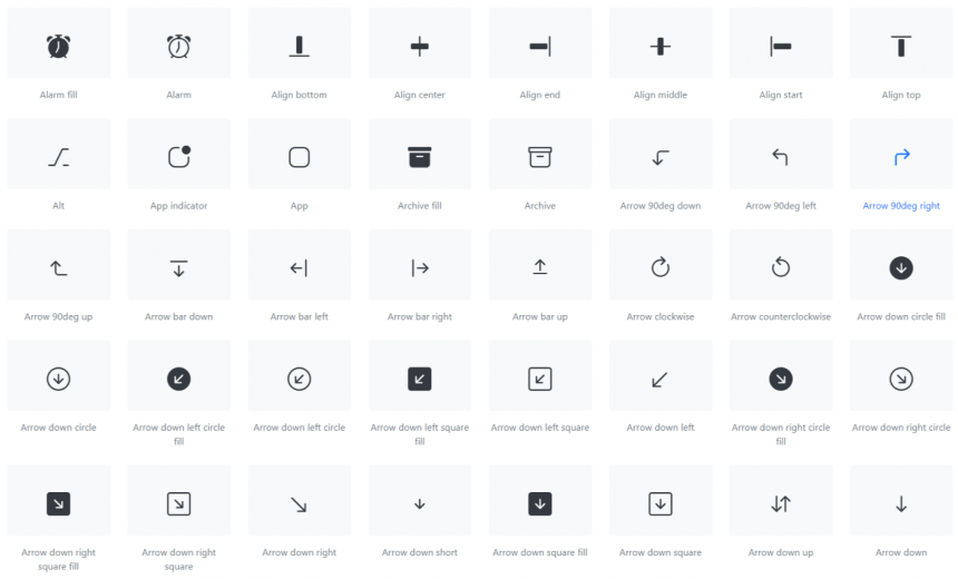
You can find detailed information about the icon package here.
With Bootstrap V5, support for right-to-left text direction, such as Arabic, is now available.
Example usage: .
For more detailed information, you can refer to this link.
To explore how these structures work, visit this page.
Note: The RTL feature is still under development and will likely evolve based on user feedback.
RFS (Responsive Font Sizes) is a side project of Bootstrap that was initially developed for resizing font sizes. It is a unit resizing engine known as “Responsive Font Sizes.”
Today, unit values like RFS can also be applied to various CSS attributes, such as margin, padding, border radius, and even box shadow.
RFS allows you to scale font sizes according to screen dimensions.
For detailed information, visit this link.
If you are using Bootstrap V4 and want to upgrade to Bootstrap V5, click here for details on what you need to do.
You can also follow the latest updates on the official Bootstrap Twitter (X) page.